Ethan's Name Plate
My daughter Evie was given a very nice thing soon after she was born - her name cut out of a piece of wood. My son Ethan however wasn’t bought such a thing and I decided that I should try to make something along the same lines. The idea developed into making a nameplate for his bedroom and after thinking about it for a little while I came up with an idea.
The laser cutter is still my favourite thing in the DoES Liverpool workshop, and the thing that I’m most capable of using, but it does have its limitations. It only produces flat things, it can only cut thicknesses of maybe 3-6mm, and it really produces things in only 1 or 2 colours (the colour of the material and whatever colour it turns out if you engrave).
I don’t entirely remember where the idea came from but I decided that I’d like to try layering multiple materials on top of each other to allow me to introduce more colours. I also came up with the idea of a forest scene. Part of the idea behind this was to give me the option of mixing wood and acrylic together in the piece. I decided on a night time scene as that feels like the most interesting time to be in a forest, with a full moon beaming down and some of the nocturnal creatures coming out.
I don’t really think of myself as a very artistic person but I did want to avoid simply pulling together clip art so I decided that I really had to create all the elements that I was going to use by myself. As I work most of the week and do childcare most of the other times I really just had short snippets of time to work on the project during the evenings. I find this can actually work quite well sometimes as it forces me to think about things more rather than just diving in and rushing things. Although it can be a little frustrating when a few days goes past and all you’ve done is draw a few branches!
For the night sky I decided to try a few things that might make it more interesting. Laminated acrylic is a thin plastic material that is made by layering two colours of material together. One of the layers is particularly thin and is ideal for engraving. Generally when you engrave acrylic on a laser the result is actually really subtle. Whereas with plywood where you go from a quite light brown to a much darker brown, acrylic doesn’t really change colour, rather it’s more the shadow caused by the indent that you see. With the laminated acrylic you can get a much more noticeable difference as the thinner layer gets engraved away showing a completely different colour underneath. Looking at the colours of laminated acrylic available there was a nice black on white option that would really work well for a night sky as I could engrave away the black to reveal stars and the moon.
Going for realism I also decided that I should really make my moon more than just a big white circle. Fortunately just a few weeks earlier there had been a super moon and lots of people, me included, had taken photos of it. I used one of the pictures I had taken and applied the “Posterise” filter in the Gnu Image Manipulation Program (GIMP) to reduce it to just a few colours. I then used Inkscape’s “Trace Bitmap” feature to convert this into vectors suitable for the laser cutter. Even with the laminated plastic you still only really get 2 colour options but I decided to try engraving the material twice, so that I engraved the black to reveal white underneath, and then on top of that white did some further engraving to add texture to my moon. The effect actually came out really well, I was very happy with the result.
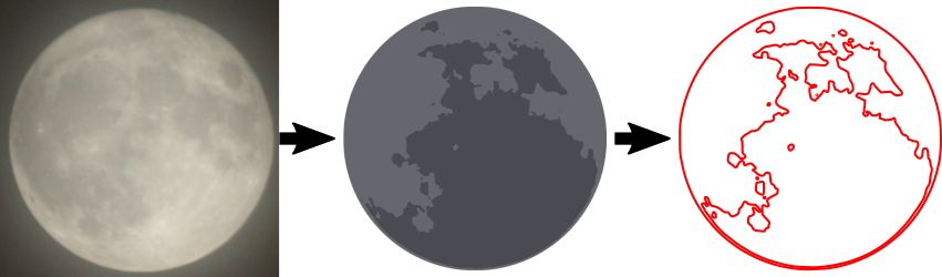
NASA release most (all?) of their imagery under a public domain license so there’s a few more little items of interest that I added but will leave them to be found rather than describing them here.
The sky layer was quite simple to do structurally as it simply consisted of a rounded box with the moon and some stars engraved on top. When it came to the other layers I was going to have to start cutting elements out, allowing the layers below to show through, but I needed to do this while making sure the whole piece was structurally sound and that pieces wouldn’t either fall through following the laser cutting, or break off easily. Fortunately even in a forest you’re going to get some overlap so I just needed to make sure that my trees overlapped enough to touch the sides and each other, whilst leaving enough space to see the sky below. I was intending to build the trees up from two layers, one for the branches and another for the foliage but again I wanted to make sure I left enough gaps in the foliage so that you could actually see and appreciate the tree trunks I’d put so much time into designing. I did this by mixing some conifer trees with some deciduous which gave me good opportunities to show the trunks. I do like the idea of having hidden elements which, even though they won’t necessarily be seen, I have still put some care and attention into having them look at their best.
The foliage for a conifer tree is fairly simple to do, if you can imagine a child’s drawing of a Christmas tree you can imagine my artistic prowess! I wanted to add some texture to these too rather than having a plain green layer so I added some zig-zag shapes to further suggest foliage. My first attempt at doing this was to draw these shapes as lines which I cut on the laser at high speed and low power so that the line was simply engraved, but I found this gave a much narrower line than I wanted and didn’t look particularly good, so to get the best result I increased the stroke width of my lines in Inkscape then used the “Stroke to Path” menu option to turn this into a polygon that could be engraved properly. The foliage layer was again a little tricky as I had to make sure that the tree touched the frame enough that they wouldn’t break. I had to balance this with allowing enough space so that the layers below would show through. Fortunately in the final product this layer would be sandwiched by other layers and as this isn’t intended as a toy there shouldn’t be too much risk of breakage.
As I’ve said this method of working was limiting my colour options. I was intending to use plywood for the branches of the trees and green perspex for the foliage so I decided to add some woodland creatures to the tree branch layer so that I could reuse the brown for fur, as it happens they’re mostly blocked out by the other layers but there’s definitely a little crudely drawn squirrel peeping out.
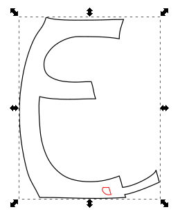
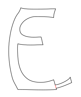
The final layer was of course the text layer. Again I decided to use plywood for this layer. I didn’t want to overcomplicate things and it felt like interchanging plywood and acrylic for every other layer would give a nice effect. It actually took me quite a long time to find just the right font. I had some idea in mind of swirly lettering but couldn’t quite work out what I wanted, I forget what search terms I was using but I think I was looking for something vaguely Celtic. In the end I found Ober Tuerkheim which gives a great effect. Again I had to work to make sure that the letters would be properly attached to the frame and wouldn’t be likely to break.
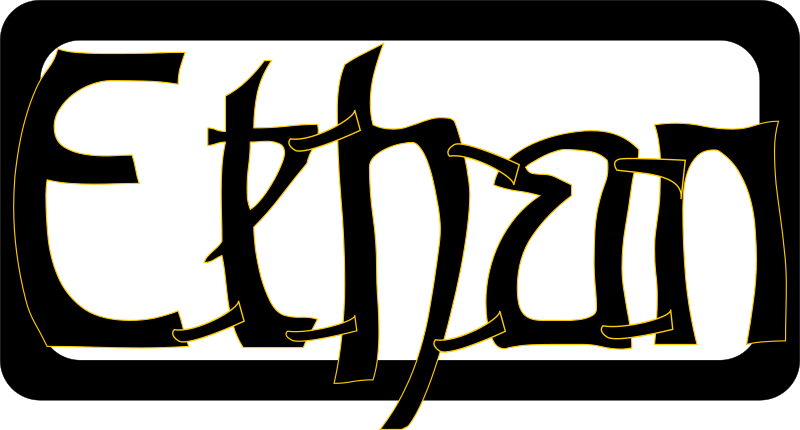
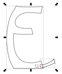
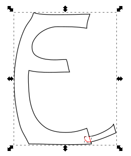
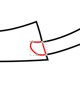
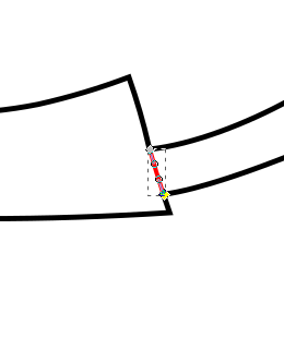
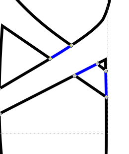
As you can see the first and last letters overlapped the frame, and the “h” was large enough to overlap the frame at the bottom, even breaking the fourth wall. To solve the issue of the other letters I ended up connecting them with small tabs. I can’t quite remember where I got the shapes for the tabs, quite possibly it was a hyphen or other shape from the font, I then moved it around and rotated it to look just right. I didn’t particularly want the tabs to be a feature of the design though so I ended up removing the ends of them. This was actually a fairly simple though time consuming process which I had used multiple times in the project to deal with overlaps, e.g the overlapping branches of the tree. Whenever I had an overlap I would want to only cut the outside of the shapes, and then etch a line to show the overlapping part. Here’s a breakdown of how this worked for the letters
- Letter and tab
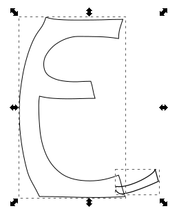
- Duplicate both paths and use the intersection tool (I’ve shifted it over and made it red so you can see it)
- Now union the original elements to get the cut path
- Moving the piece that we broke out using intersection into place
- Here you can see the nodes of the intersected piece
- In this case I don’t actually want the tab to be visible so I remove all segments apart from the one that made up the edge of the letter E
- And here is the finished product
Such a convoluted process really just to get that little line but it really does give a good effect when used throughout. I used a very similar process for overlapping branches as mentioned but here I would end up with little squares making up the intersected part and I’d need to remove opposite edges to show a single branch overlapping the other branch.
Anyway, enough about process and techniques, I’m sure you’ve been waiting to see the finished article, so here it is:
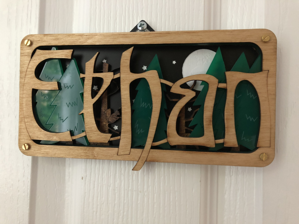
I stained the tree branch layer and used danish oil to finish the letters layer so even though they were both made with Birch ply I still got to differentiate their colours. All-in-all I was really happy with how it came out. Ethan seemed to like it too!