Week Notes Week 98
Quite a varied week this week, but also a short week due to attending a wedding on Thursday so having Thursday and Friday off. The project that was due by the 10th did get put back to “sometime in July” which is actually a good thing really as it clears space for the project I need to work on for the next few weeks. The other project that I was waiting on sign-off for still didn’t get signed off so I actually almost ended up with some free time.
Monday I worked on my Chess app. I completed the “version 1” that I’d been working on which involves managing and viewing chess games and downloading from the Internet. As it happened my timing was quite good (if 1 month late) as I was able to get the app demoed to the clients on Wednesday. I’m still waiting to hear the feedback from that meeting but a quick summary was that “the main features [are] there, but that at the same time plenty of UI adjustments worth looking at”. Which is probably good news.
Tuesday I caught up with some email sending in the morning but decided to take another look at my app store positions app I worked on a few weeks ago. I’ve now been downloading top 100s for the Apple app store for the past month which means I am storing a lot of data but wasn’t really doing anything with it. My friend Colm recently launched a World Cup iPhone app - Total Football 2010 - and it’s been interesting watching his success in the various Sport Top 100s around the world. I decided I really needed to do something with my data so knocked up a script to send daily email summaries of app positions.
First changes were to add some database tables for storing user info. I went with a basic “users” table for storing an email address and various other information that might be useful if I make this a web-facing app. Also a “user_apps” table for linking Apple application IDs to my user IDs. Both tables have a boolean column so that I can turn off the emails per-app or per-user. I then put together my script. The main thing I wanted to do was to get the current position of the app in the top 100 and a graph showing the recent performance. I decided that a sparkline was the best way to do this. I also wanted to use google charts API to save me needing to install any software to generate the graphs. Fortunately I found this page on Google Charts Sparklines and was able to tweak the settings to get exactly what I wanted. After a few runs I decided to add a few more data-points showing max and min positions, and also showing the dates that the data was taken from. Each email is supposed to show the data from the last week but if a user has no data for a time then it might show less.
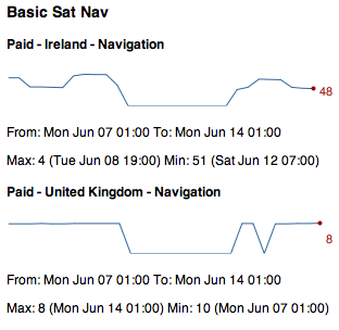
I’m quite happy with the results, and you can see an example in the screenshot above (big dip caused by my scripts failing to run for a few days :-( ), but as was mentioned by Dave Verwer there’s really quite a lot of information. When I was working on my own data I wasn’t surprised to get lots of results considering I have 28 apps live, but even when running Colm’s data with his single app he still gets loads of results because he’s being successful in lots of countries. One feature suggested by Dave was adding a summary at the top giving stats such as “iPhoneApp1 has increased by 20 places. iPhoneApp2 has dropped by 80 places” which does seem like a good idea but will require some work. Next time I spend a random half day on this I may well add that!
Finally, on Tuesday night I got some feedback about mapme.at which led to a long email conversation because it turns out the CBC (Canadian Broadcasting Corporation) wanted to use the site to track a road trip being taken by one of their presenters! They really like the fact that it can show you a whole journey and overlay the tweets and check-ins that you make along the way. Unfortunately because they wanted to show the social media on the map they couldn’t just use the existing export functionality because that will only show a trace. To help them out I made a special version of the existing “history” page which I termed the “headless” version. This version takes off the top and left bars of the page leaving only the map, the timeline and the lifestream of social media on the right. I also modified the page so that instead of just saying “I am here” it now shows your username and profile pic instead. They seemed really happy with the changes and I’m hoping this will lead to some increased traffic and more users for the site. If you’re interested you can take a look at the page here. They’re using Google Latitude to trace the journey and it looks like they didn’t turn it on for the first stage but I’m hoping that from here on out they’ll have it running continuously, still looks pretty good though.
This week I’m beginning a new 2 week project working on a music app for a pretty big client. Not going to go into too much detail straight away but hopefully I’ll get to talk about it more when I get a little way through it.
Comments
— Colm