OSM Quality Evaluation
Muki Haklay recently put together a blog post about a report that he has been working on over the past year on the evaluation of Open Street Map (OSM) data. I thought I’d link to it here partly to highlight the interesting work he’s done here and also to make a few comments. If you’re at all interested in the OSM project then be sure to head over there and read it.
One of the aspects that I thought he may have missed relates to the way OSM relates the history of OSM entities. A comment I made on his blog follows:
As far as I can tell though the research doesn’t take into account the history of elements in OSM? When you’re looking at the number of users that have worked on an area, you may actually be discounting users who have worked on an area in the past but whose username was then replaced by later edits? I think it’s very important to take this into account as the very peer-reviewing that you are demanding can actually result in the appearance of *less* usernames.
His reply makes it clear that he has thought of this and that he’s happy that by inspecting the data at the level of nodes this is less likely to be an issue. It’s true that in the majority of cases a fix would involve simply moving a node or two along a way. Even though both of the main editors now give you the ability to move a whole way (and all the nodes) at once, which would result in the replacing of the username on the way and all nodes, I’ll admit that this is unlikely to happen very often. That said though, I’m still a little nervous about completely ignoring the history. Any comparison that concentrated on nodes, e.g. only POIs, rather than ways and nodes would have to take this into account much more but clearly Muki’s aware of this and is likely to take it into account in the future.
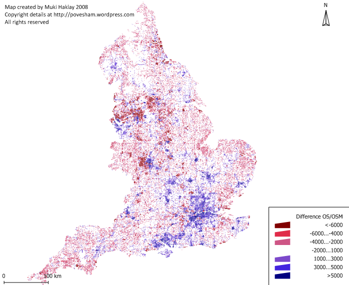
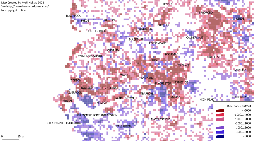
The report (and indeed the blog post) features the above image showing the difference in coverage between OS Meridian and OSM across England. Blue areas show where OSM coverage is good and red shows bad coverage (compared with OS Meridian). I was initially disheartened by the big red blob over Liverpool and most of the North of England. When I looked at the full size version and squinted a bit I was able to see that South Liverpool shows up as a very small blue smudge amongst the red. The following image is a closeup featuring Liverpool and Manchester. From this it’s much easier to see the South Liverpool and Chester are actually pretty well mapped as well as the South West quadrant of Manchester and a few other places, but the majority of the North needs work. Think we need to get some mapping parties planned!
(It’s also worth noting that the data used for this is at least a few months old by now too, I know the Wirral is looking much better these days and some work is being done on Manchester and Leeds)